

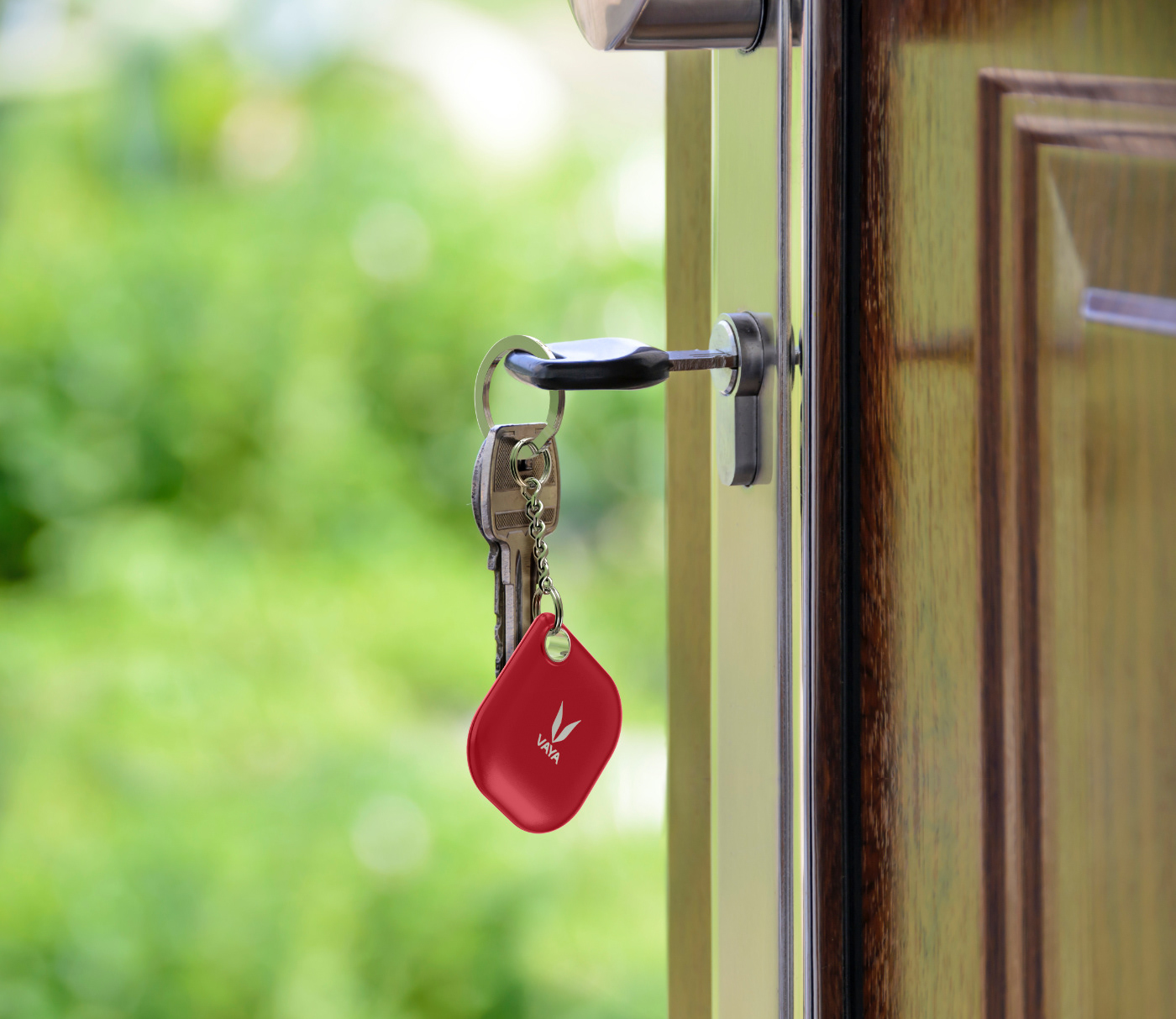
Lynk is a companion app for a bluetooth tracker. I was involved throughout the entire project, initially as an industrial designer, conceptualizing the device, then as a UI/UX consultant, supervising and assisting, and lastly as a graphic designer, working on online promotion.
Below I am providing a slightly edited version of the project, allowing you to see my take on things.

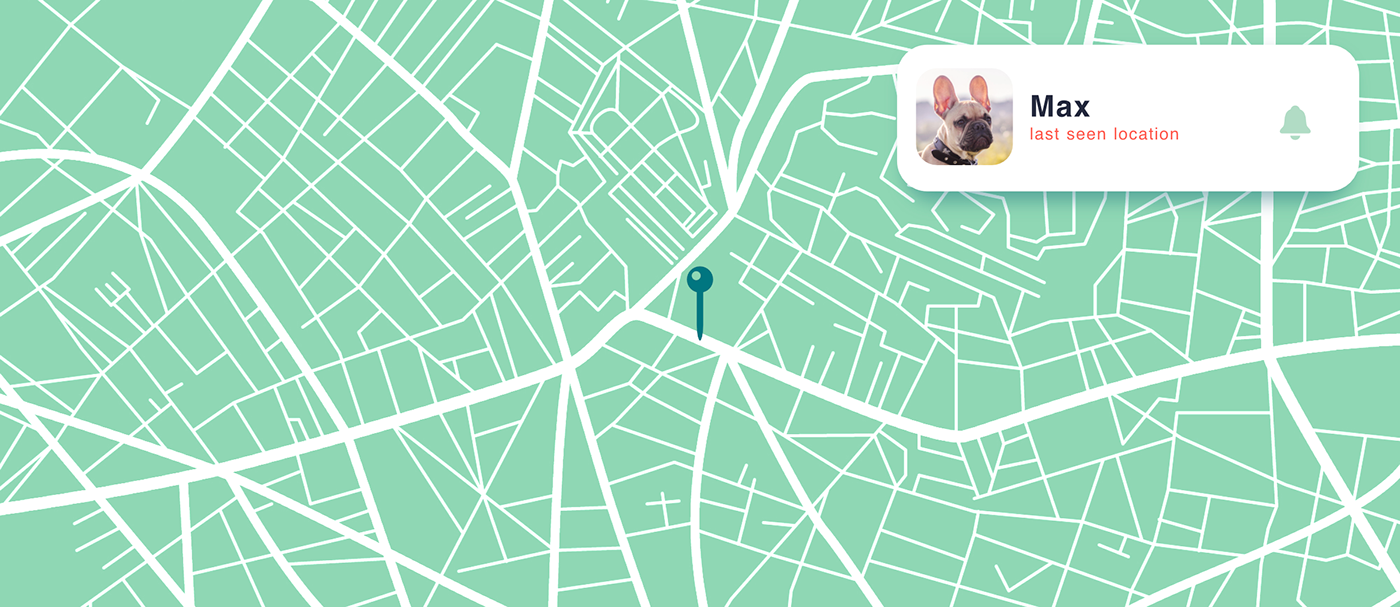
Because Lynk is a companion app, i.e. the main product is the bluetooth tracker, and the app is not accessed regularly and is often used in an "emergency", such as trying to find keys in a hurry, looking for a lost pet, etc., our priorities were reduced to efficiency (ease and speed of use) and integration with the company's services. This resulted in some clashes with some of the more complex features.
During our research, we looked into existing apps, such as Tile (the leader at the time) and Chipolo, but the hierarchies were not to our liking and did not fit some of our client's priorities.
We went through multiple concepts and initially tested only in-house for quick iteration. In the beginning, we split the app into different paths per feature, prioritizing ready to release ones (some are not shown and I have omitted signup/login for clarity) and organizing them by required speed of access. This facilitated later work on user flows.

As there was a confirmed set of features to be implemented during the first year and a half, and the project was supposed to be offloaded to another design team later on, the app was built in reverse. We included all existing and planned features into the design and then removed those not ready for the initial release. This gave us a better perspective and helped define the overall approach, although it meant virtually building and documenting two apps. We did not merely remove elements from the interface, but built it in a way that it can be easily expanded.
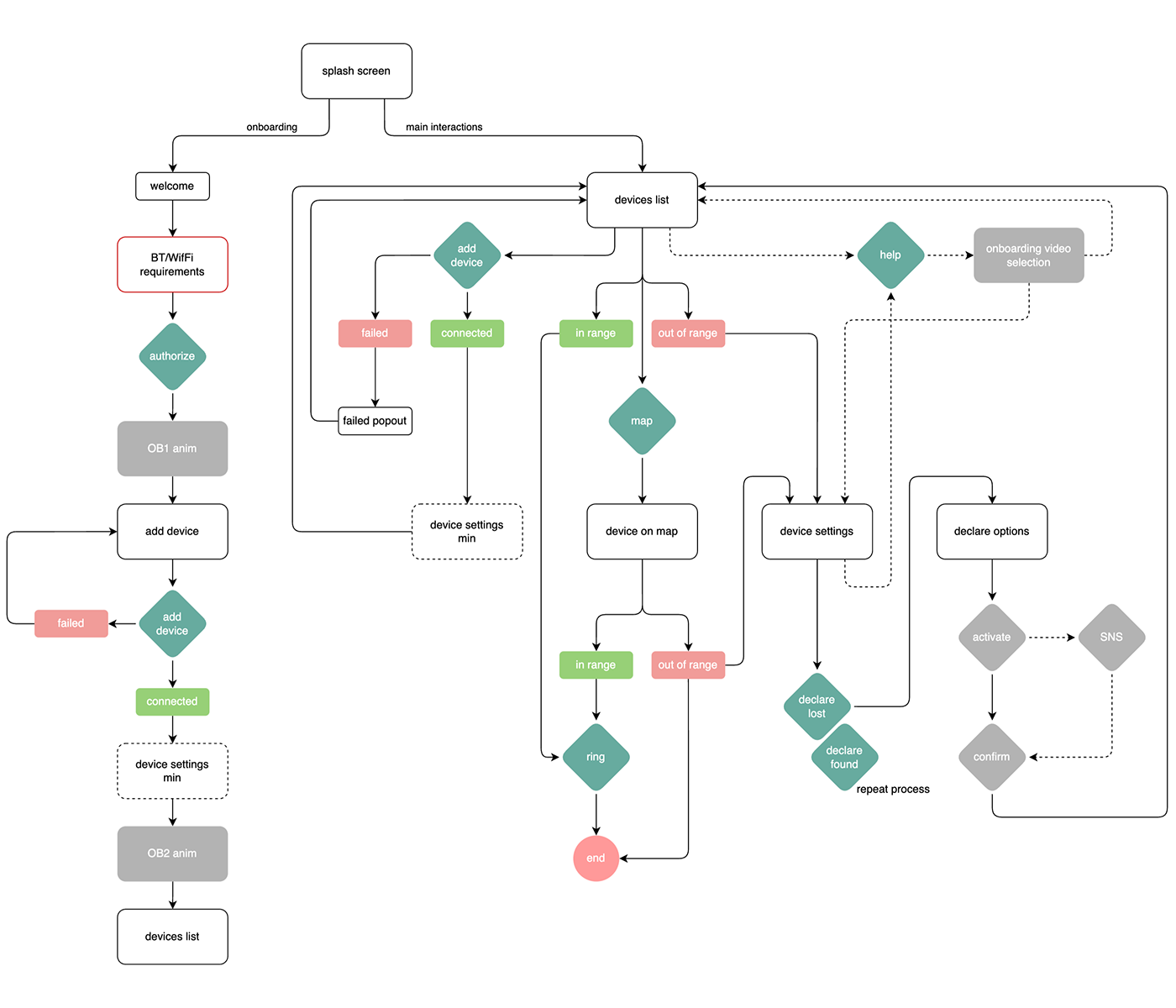
Once our data was organized per feature, together with our and the client's requirements, we worked on simplifying the experience, while keeping in mind upcoming features.
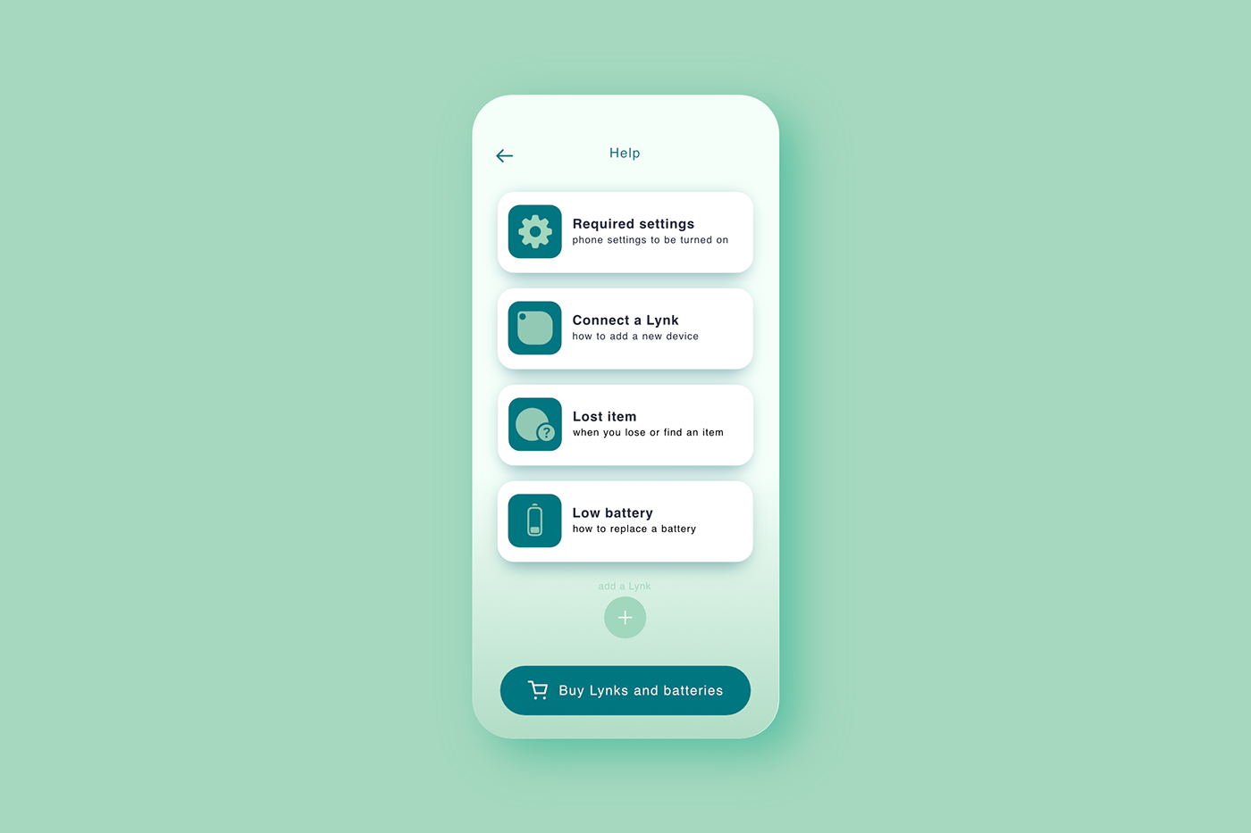
For example, for user flows with a low priority of speed of access and requiring user authorizations, we focused on repeatable interactions, instead of making everything faster, but less consistent. For example, when a lost item is found, after the notification the user has to move through the same flow as for declaring it lost. We also simplified the help section down to a few short animations.

Lastly, we also integrated other services provided by the company, such as direct access to the store for purchasing devices and batteries, which also allows the client to advertise other products from their lineup.
We kept most of the explanations visual, avoiding text as much as possible. Feature introductions (above) and how to's were all animated in short segments, allowing us to unburden the interface.
Ultimately, the biggest challenge was cross-referencing feature paths with user flows, while keeping things snappy and intuitive.


